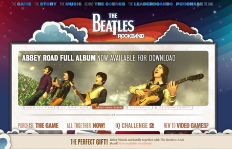
The BeatlesTM Rock BandTM site has a fun, whimsical, multi-layered design that has a nice bit of mouse-candy, but not too much, and lots of rich, ever so slightly desaturated colors that keep it from becoming over the top. The interactions are clever and the illustrations update the style of the BeatlesTM, which was often cartoony, but never as cohesive as this. My only quibble is that the static footer takes up way too much space. On a laptop, it really minimizes the content area. All in all it’s a fun site to click around in.


0 Comments