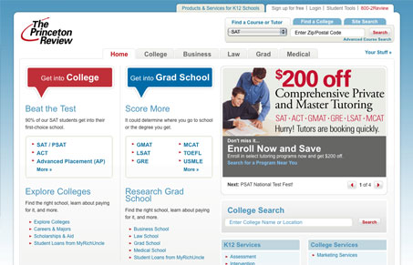
Very much a portal website, it has a huge amount of content/data, but the site is very well organized and almost every little nook and cranny of the site has been touched by the designer(s). It’s no-nonsense working design, usable and geared for getting at the content quickly.
Glassmorphism: The Transparent Design Trend That Refuses to Fade
Glassmorphism brings transparency, depth, and light back into modern UI. Learn how this “frosted glass” design trend enhances hierarchy, focus, and atmosphere, plus how to implement it in CSS responsibly.


0 Comments