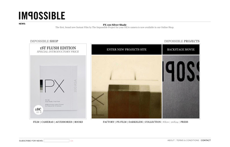
Aside from it being awesome that you can finally get film for your Polaroid camera. The home page here is all white but any of the sub pages have an all black background. I really love the white background design and the large pictures that that the home page displays. Some nice fitting typography and a clean simple design make this site work out well.
Glassmorphism: The Transparent Design Trend That Refuses to Fade
Glassmorphism brings transparency, depth, and light back into modern UI. Learn how this “frosted glass” design trend enhances hierarchy, focus, and atmosphere, plus how to implement it in CSS responsibly.


0 Comments