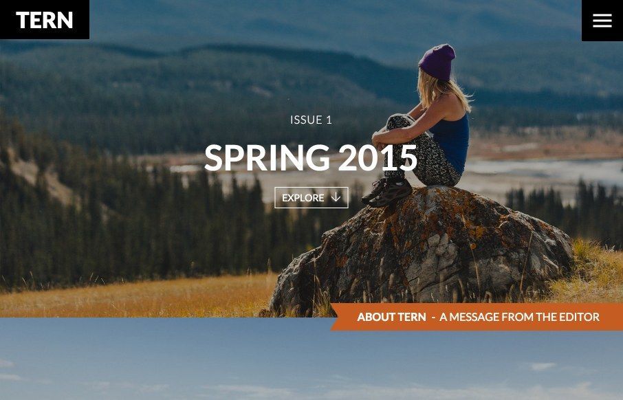
I dig the layout of this site. The strong grid and the interplay with some of the blocks and the background sections is nice and there’s some nice little animation layered into the interactions. That big drop down/hamburger menu is actually kinda nice. I’m not in love with it being behind the hamburger icon/button but the way it’s used in conjunction with the fact that you really don’t need it to get through the latest posts wins in my book.
From the Designer:
This was a fun project on a budget and timeline that came together quickly and has been a success for our client Hostelling International Canada.
Submitted by: Mark Vidalin
Role: Designer & Developer


0 Comments