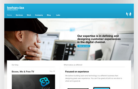
This site looks like a standard clean agency website, then you move through it and it starts to have a lot of character. The big blue header with the image worked in underneath we’ve seen before, but the sub pages are where this site comes alive. My favorite is the “company” page, that’s a really great idea. The labs section was also a really nice surprise when I got to it.
Glassmorphism: The Transparent Design Trend That Refuses to Fade
Glassmorphism brings transparency, depth, and light back into modern UI. Learn how this “frosted glass” design trend enhances hierarchy, focus, and atmosphere, plus how to implement it in CSS responsibly.


0 Comments