
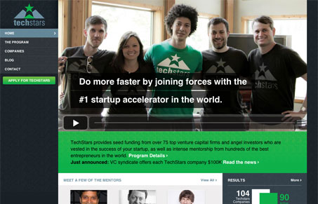
I like this rather utilitarian design approach. It’s largely focused around the main image, which is a video, then with a fixed navigation to the left rolls you into more content pretty easily. It’s also responsive and has some nice choices shown for the different screen approaches.




0 Comments