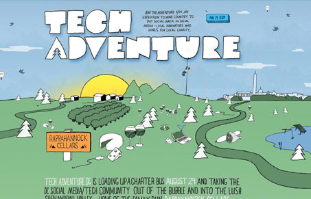
Just a fun looking website for a conference. I love the illustrations across this site and how the designer used some standard 3rd party things, like the facebook network widget, and made it fit within the illstrative design. I’m not as in love with the single ‘long’ page approach to this site, I think it would work just as well as a traditional website being broken into individual pages, but it does work in this setup. Overall I enjoyed looking through this website and finding some things that made me stop and think about how they were done.
Glassmorphism: The Transparent Design Trend That Refuses to Fade
Glassmorphism brings transparency, depth, and light back into modern UI. Learn how this “frosted glass” design trend enhances hierarchy, focus, and atmosphere, plus how to implement it in CSS responsibly.


0 Comments