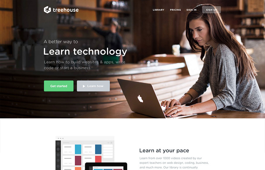
Newly updated design for Treehouse. The design is incredibly focused and direct yet at the same time the photography and illustrations are open and inviting feeling. The color palette also plays on the essence of making you feel relaxed. Good responsive work here too, particularly the way the main image scales – keeping the image focused properly across mostly all device widths.
Glassmorphism: The Transparent Design Trend That Refuses to Fade
Glassmorphism brings transparency, depth, and light back into modern UI. Learn how this “frosted glass” design trend enhances hierarchy, focus, and atmosphere, plus how to implement it in CSS responsibly.


I like your point about it being well focused. The new design feels much more grown up and “premium” than the previous one which I’m guessing is the direction they are taking.