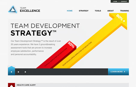
I like the big bold info-graphics used on the home page of the Team Excellence website. There’s a ton of information on this site, graphs and charts and psychological explanations and the design makes it all seem like it’s accessible to anyone. A good design can do that.
Glassmorphism: The Transparent Design Trend That Refuses to Fade
Glassmorphism brings transparency, depth, and light back into modern UI. Learn how this “frosted glass” design trend enhances hierarchy, focus, and atmosphere, plus how to implement it in CSS responsibly.


Nice use of bar graphs, poor logo implementation.. too light, requiring drop shadow.
The rest is fairly standard fair… light grey, blue-teal, slideshow, serif fonts. Overall nice though.