
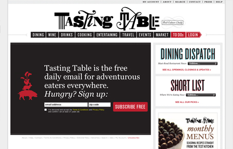
I like how like 80% of the site is static and the only thing that scrolls is that sidebar. I think some of the type is all over the place, it could stand to have a little more simplicity style wise IMHO, but overall it’s really workable and visually interesting to make me want to sign up.




0 Comments