
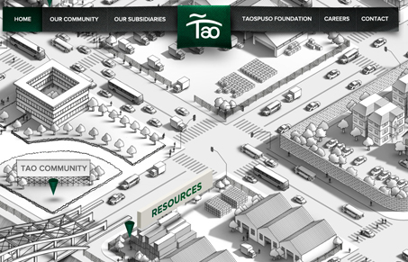
Very interesting mix of navigation “stuff” happening on this website. It has a nice looking fixed navigation bar along the top, which feels very traditional. Then it has this larger more explorative type interface where you mouse around on an illustrated map to find places to read more from. It’s clever, it feels pretty intuitive. I like it.




0 Comments