Screencast Review

symphony-cms.com

symphony-cmscom

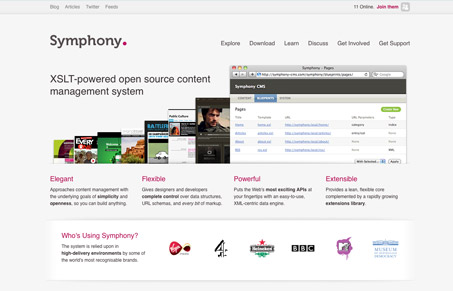
Really clean product website. I like the grid and the way the images of the browser with the sites in them are placed on the page in this design. It’s the standard “here’s a browser with our stuff in it” but it feels different with the way they’ve treated it. That and the strong grid make this a really good looking site.

Make sure and check out our screen cast review of symphony-cms.com for more in-depth details of what we thought.


symphony-cmscom

Really clean product website. I like the grid and the way the images of the browser with the sites in them are placed on the page in this design. It’s the standard “here’s a browser with our stuff in it” but it feels different with the way they’ve treated it. That and the strong grid make this a really good looking site.

Make sure and check out our screen cast review of symphony-cms.com for more in-depth details of what we thought.

Kinsta

2 Comments

  1. Alan Clark

    Great Review. I like the clean look, I would be interested to try out this cms.

    One thing that really caught my eye was the giant comment box with the WMD editor on the ‘Get Support > Contact’ page.

    Reply

Submit a Comment

Your email address will not be published. Required fields are marked *

Time limit exceeded. Please complete the captcha once again.

News & Articles

Fitts’s Law: Why the Easy Button Wins

Fitts’s Law: Why the Easy Button Wins

Large, close targets are faster to hit than small, distant ones, that’s Fitts’s Law. A look at the 1954 rule behind buttons, prime and magic pixels, thumb zones, and dark patterns.

The Call to Action, Revisited

The Call to Action, Revisited

The Call to Action hasn’t changed in a decade, but the bar has. A fresh look at prominence, copy, mobile tap targets, and accessibility, with lessons from three major design systems.
