
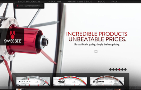
Really simple and clear bike tire website. I like it when you have such great photography that you can basically just throw that out there up front and let it do all the talking, like in this design. I also like the three block areas with the three different types of tires they have.




0 Comments