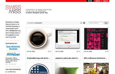
Tina Roth Eisenberg submitted this newly designed site for her design blog and studio. She had this to say about her site:
swissmiss is a design blog and studio run by tina roth eisenberg – a swiss designer gone nyc. The newly designed blog offers fancy filtering options, a choice between the ‘swissmiss grid view’ and a regular blog list view
I think this is a really well-laid out site. It has a tight grid, and every minor detail has had some attention paid to it. The ‘swissmiss grid view’ is clever and it’s a different way to get at the same content, which leads to the real reason this site is successful, the posts! She posts very frequently about interesting, current design topics.


I’ll have to add that the ‘grid view’ is also probably my favorite part of the site. Very clever there.
Love the white space and the simplicity of the design.
The grid feature gives users control over how they interact with the site–very successful. I just wish the options to do so was a little more prominent. I’m not sure I would have known that I could change the view if I hadn’t been alerted to it.
I’d like to see a little more content also. I love that there are multiple blog posts per day, but I’d like to have a bit more to digest, both on the blog and beyond.
For me the grid view was unutterably slow–over 10 seconds to load.
Nice idea, but not much point if it’s not actually usable.
Otherwise the layout is pleasant (unextraordinary?).
Emlyn, Yes, the loading of the grid view was slow yesterday. It was a bug, we just fixed it. Try again!