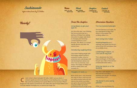
Pretty nifty looking non-standard type design. It looks like a pseudo three column layout approach but the footer, or second level of content, is throwing me off. I do love that illustration, very funny and memorable. The background texture/image is also very nice.
Glassmorphism: The Transparent Design Trend That Refuses to Fade
Glassmorphism brings transparency, depth, and light back into modern UI. Learn how this “frosted glass” design trend enhances hierarchy, focus, and atmosphere, plus how to implement it in CSS responsibly.


0 Comments