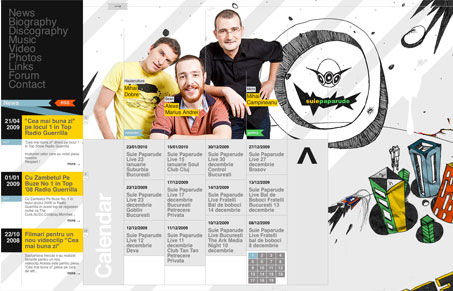
Really interesting layout. I’m not totally sold on if it works or not. Give the screen cast review a watch and hear more of what Julia and I thought. I definitely find myself exploring it and digging deeper, so I think the design has done it’s job. It also really sticks in my brain after i’ve left the site, so it’s rather memorable to me. The illustrations are intriguing and fun. However having it scroll both up and down and side to side, makes it very odd to use when you have a magic mouse or trackpad, the movement can be unsettling when you see it – it’s not too bad, but a little goes a long way.
Glassmorphism: The Transparent Design Trend That Refuses to Fade
Glassmorphism brings transparency, depth, and light back into modern UI. Learn how this “frosted glass” design trend enhances hierarchy, focus, and atmosphere, plus how to implement it in CSS responsibly.


0 Comments