
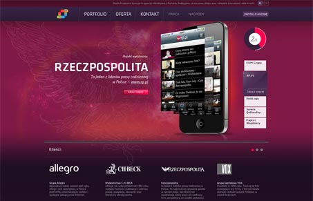
I like a lot of design elements here, the large main image and the fixed header – the type and tone of it is pretty nice. There are some interaction elements that don’t make sense though, like the horizontal slider below the main image, I can’t figure out what it does exactly. Overall the look & feel is nice and has a high level of polish.




0 Comments