Submitted by: Patrick Flynn @StudioNudge
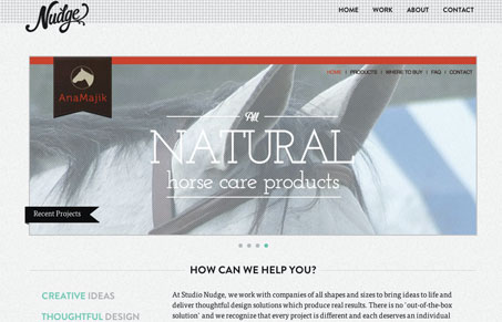
I believe our site is subtle yet powerful. We went with a one page scrolling website because we feel that will be the next move for upcoming websites. It makes the site easily functional and you never have to load a page after you get to our homepage. As content builds, confusion will not, this is why I believe our design and layout is worthy of a submission.
Studio Nudge is a four-person studio out of Charleston, South Carolina. Their site has a nice flair to it. The handsomely drawn logo sits atop a fairly minimal design with a logical hierarchy, from the recent projects down to the about section. The ‘work’ detail page is very attractive and fleshed out with lots of nice photos. My only quibble is that I would prefer it if the logo stayed in place when you scroll. The fixed navigation is cool, but keeping that nice logo in place along with it would be better.


studionudge is a well design firm and they are good at creative works.
I pray and hope for the studio Nudge team for better success in future