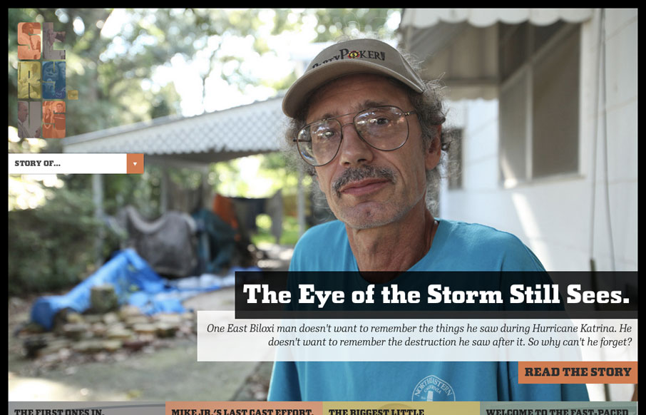
This beautiful site takes full advantage of responsive design to deliver a compelling visual experience at every resolution. The massive imagery is nicely offset by asymmetrical text and bold, hard-lined shapes. In my humble opinion, stry.us seems to look best at around 1200px, but all breakpoints make sense and keep the layout from ever looking too disjoint, as can often happen with poorly thought out responsive designs. Last, but not least, the stories are great.

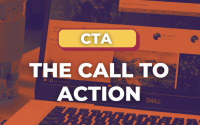
The Call to Action, Revisited
The Call to Action hasn’t changed in a decade, but the bar has. A fresh look at prominence, copy, mobile tap targets, and accessibility, with lessons from three major design systems.


0 Comments