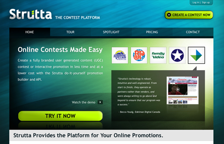
There’s so much I like about this site. I love the colors and background image, very nice. The top most section, where the featured clients’ quotes are placed is really smartly designed. I love the logos that interact with the ” “speech bubble” type effect pointing to them. The basic tabbed style like navigation works here for me and the branding is simple but really nice looking. I also think the footer is very functional but not overpowering.
I think the second half of the page, the part that starts with the 3 columns and leads in with the icons down to the footer area is fairly weak. There’s just too much text and it’s not easy to scan visually – there’s just nothing that’s compelling me to read any of it.
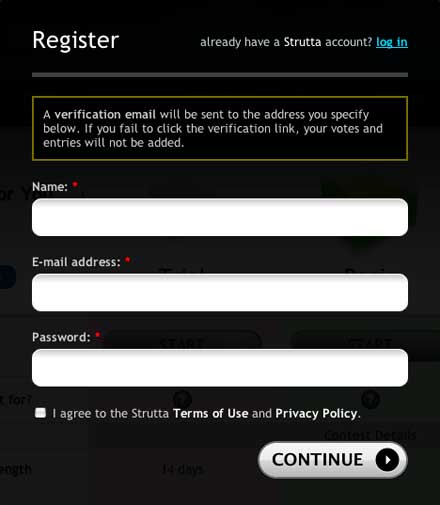
My favorite part of the entire site is the sign up form:

It’s simple and clean and gives me all the queues I need to complete quickly and efficiently. I love how it’s in a modal window, making only the links that you need the user to get to, like the submit button, the only accessible links in the window/page. Very smartly designed.
However, I must get to this form by clicking the “start” button linked off the account selection screen, that loads a log in modal window with this sign up button a link from that form. That’s pretty well hidden, i’m not sure why it has to be so hard to get to. I think this is a great part of this site and for more conversion’s sake i’d surely put that sign up form directly accessible off those “start” links.


Hey Gene,
Thanks for the review. We agree with virtually everything you have said, and we would be delighted if you’d take a peek at our new design, due out in a few weeks.
I especially like your comment about the positioning of the reg form. There are a number of ways to navigate to it, but I agree that the flow of Start > Pricing > Reg is one click too many, and is costing conversions. Expect to see changes soon.
Thanks again for taking a look at us. Our UI designer was proud of your assessment, and he has always insisted the page was too text-heavy.
Keep up the great work,
Jordan Behan
Strutta.com
Jordan,
You got it, reviewing websites is what we love to do, so you bet we’ll take a look at your new site when you launch. Don’t forget to send it our way when you do so we don’t miss it.
I love that sign up form!
I’ll drop you a line when we publish it. Cheers, Gene.
I like the cool colors and movement of the background image.