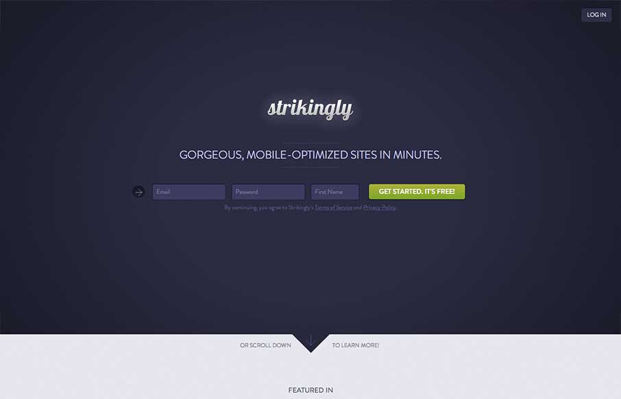
I like the minimal approach mixed with the full on product tour in the middle section of this site design. You start and finish with the same form layout as you scroll through the page. I also study sign up forms a good deal and I like the horizontal layout of the form here, the little animated arrow is also a nice addition that just grabs your attention and slams it down on the form. Nice work.


The Call to Action, Revisited
The Call to Action hasn’t changed in a decade, but the bar has. A fresh look at prominence, copy, mobile tap targets, and accessibility, with lessons from three major design systems.


0 Comments