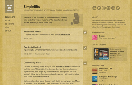
It’s neat to see Dan Cederholm move to tumbler for his blog platform – I happen to really love tumbler so it’s cool to see that for what it’s worth.
Of course you don’t expect to be let down by anything Dan produces, and with this newest iteration of simplebits i’m not. Using some great textures and subtle details this is one of those sites that makes me want to revisit some of my old design projects. I love how it changes colors/tone as you go from page to page too, subtlety brilliant stuff. That’s the thing about Dan’s work, it’s so subtle yet strong it makes you want to just punch a wall…


Really? I think this is actually quite a big let down from someone of Dan’s undoubted talents.
I can see the appeal of something like Tumblr for a maintenence point of view and I’m sure it’s easy to design for but this in my opinion is a big step backwards by Dan.
I suspect I’ll be on my own in this opinion but if this were submitted by “joe unknown” I doubt it would receive much attention.
Sorry to sound negative, I really am a big fan of Dan’s other work!
I’d have to disagree James. I quite like this design plus since it’s on tumbler it’s kind of like a promise to hear from him more often on his blog… Though there are some aspects to it where it’s not traditional looking Cederholm style design.
What is it specifically you’re not digging though, that’s not a setup i’m curious.