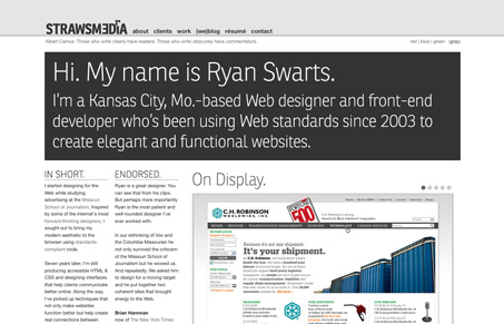
I really like the feel of Ryan’s portfolio site, it has a nice minimal style to it and the main typeface used, Ronnia, is very nice. There are a few things, however, that keep this site from being great. First is the spacing and use of negative space. When a design is mostly text and monochromatic, there needs to be plenty of space around all of the elements. This will make the text easier to read and allow featured elements to stand out more. The logo and navigation are too close to the shadow in the header, some breathing room would really make it work better. Also, the type sizes need to have a distinct hierarchy and be consistent from page to page. The body font is just slightly too large and looks rather clumsy next to the small type in the sidebar and footer. I think if either the body font was bumped down a bit, or conversely the sidebar/footer type was bumped up it would make them feel more like part of the same design.
The way the work is presented could be better also. I’m not sure why there are no links to the actual websites, on the work page each item links to a new tab (also not a good idea, let the user decide whether he/she wants a new tab) where some of them have list of links to images, and others are html pages, but not the actual site. There’s really no consistency. If I really want to check out your work, then a couple of screenshots within your site, a bit of copy about what you did, and then the actual website is really what I’m looking for. If a site isn’t live yet, that’s ok, just say so or don’t put a link.
Submitted by Ryan Swarts, @swartsr. Designer & Developer.
Portfolio of Kansas City, Mo.-based front-end developer and web designer. It’s clean, modern and elegant.


0 Comments