Submitted by: Brad Haynes, (@bradhaynes)
Role: Designer
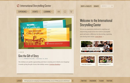
The site needed to cater to the past 30 years of loyal supporters and festival goers, while also providing a platform for an evolution to a more international brand. It boasts a massive amount of unique design layouts and elements and carries a warm color palette to create a truly welcoming environment. Enjoy!
This website design is so full of detail work it makes me smile. From the drop down navigation elements to the the way it handles something as simple as the small images around the site. The textures and colors lend to setting a very relaxing tone. The typography is also tight and well executed.
I especially like the donate form, and this element in particular:
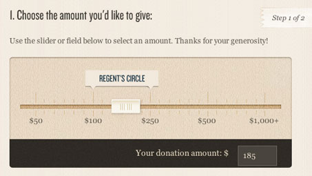
This is one of the first times I’ve seen this type of input element on a client focused website, you see experimentation with form UI like this a lot on product websites or personal portfolio sites. I love seeing the envelope being pushed like this!


0 Comments