
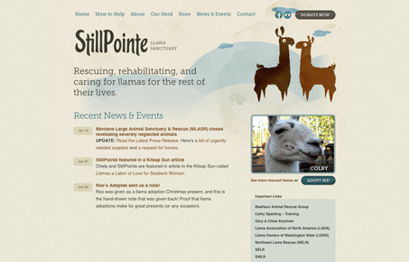
I like the way the illustrations are produced, they look a little like watercolors, that’s nice. I like how the illustrations are used as well, to make you feel more caring toward the animals, they look cute and all that. Nice typography and nice detail on the contact form fields for webkit. I also really love the newsletter signup area, it really makes me notice it to have it treated with it’s own illustrations.




0 Comments