
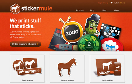
The stickermule.com website is straight forward in it’s design. Love the colors and sample illustrations. The three big selection boxes for the different products they offer is really clear and tells the story well, in using big images of the products like that. The individual product pages are also quite nice and clear.




Thanks for the comments. We have a bunch of improvements planned, but it’s nice to hear the site is already liked. 😉