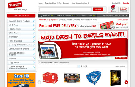
New staples website design. Vastly improved layout with a nice clean grid based design. I’m really liking the mega-drop downs too, those feel like they work really well.
Glassmorphism: The Transparent Design Trend That Refuses to Fade
Glassmorphism brings transparency, depth, and light back into modern UI. Learn how this “frosted glass” design trend enhances hierarchy, focus, and atmosphere, plus how to implement it in CSS responsibly.


I’m a little overwhelmed by some of the mega drop-downs. I think that I’d like them after working with them, but at first interaction with them, my user experience is a bit jarred.
I really like the footer, though. It’s big and kind of grounds the design. It also helps by giving quick links to important pages.