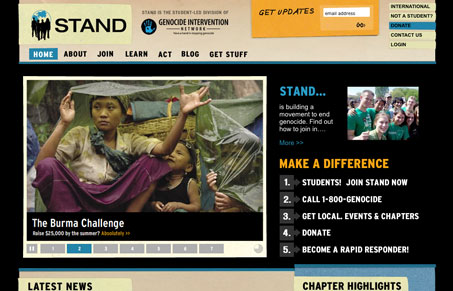
This site design has a lot of stuff going on with it, there’s textures and paper like edges on the boxes, it’s all done really nicely and with care. I’m not too hip on the fact that the main navigation is image based, seems like those could easily be just text based, probably make the site a little better but it’s definitely not a deal breaker on making this a great site. The “call to action” areas under the “make a difference” header are really nicely done, they are clean and clear and I like the numbered icon that goes along with them. The sidebar starts to get in the way when there isn’t much content on the sub pages, it seems to make the pages scroll longer than they should. Overall really well done site design that really gets the message across quickly, which is what it should be doing.
Glassmorphism: The Transparent Design Trend That Refuses to Fade
Glassmorphism brings transparency, depth, and light back into modern UI. Learn how this “frosted glass” design trend enhances hierarchy, focus, and atmosphere, plus how to implement it in CSS responsibly.


0 Comments