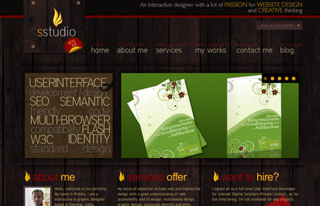
This is a nice dark background, personal portfolio site. All of the graphic elements are done well but I would suggest that the typography needs tweaking. There are certain areas of the page where the copy is overwhelming to the eye, like on the homepage where words like “SEO” and “flash” are just jumbled together. There are also a few things about this site that I don’t understand like why he calls it “S Studio”, why there’s a “2.0 Beta” sticker on the logo and then why the button “view my full profile” would link to his blog.
Glassmorphism: The Transparent Design Trend That Refuses to Fade
Glassmorphism brings transparency, depth, and light back into modern UI. Learn how this “frosted glass” design trend enhances hierarchy, focus, and atmosphere, plus how to implement it in CSS responsibly.


I love the design 🙂
A slight usability issue though, when clicking on a link to another page the majority of the page stays the same which suggests that the header is taking up more than 75% of the screen (at least on 1024×768) and so it feels you’re still on the same page.
Thanks for your comment Liam
Liam, you’re right about the header. He could probably just do without that middle block (with the slideshow) on the subpages – especially since it doesn’t have too much importance.
nicely done man