
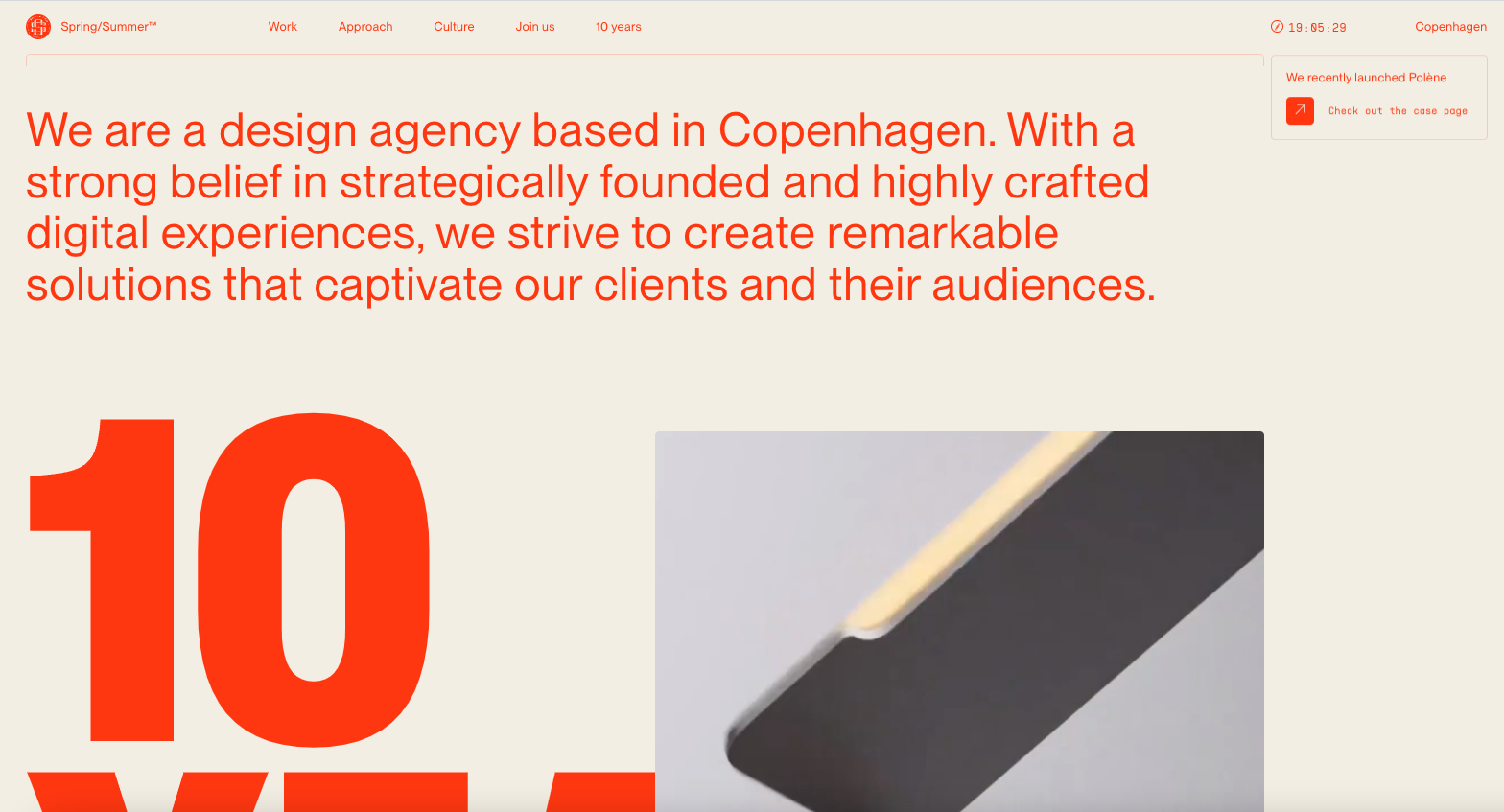
I just LOVE the tight layout and grid that’s paired with such distinct differences in typographical choices. So solid. Different colors for each page/section just reinforces the thoroughness feeling behind the brand. Great work.


Fitts’s Law: Why the Easy Button Wins
Large, close targets are faster to hit than small, distant ones, that’s Fitts’s Law. A look at the 1954 rule behind buttons, prime and magic pixels, thumb zones, and dark patterns.


0 Comments