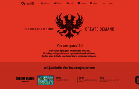
Space150 is a company that obviously takes a very bold approach to everything they do. The logo, a two headed phoenix grasping a hammer and lightning bolt is meant to convey the philosophy of ‘Destroy Convention, Create Demand’. This attitude has apparently worked out judging by the clients they’ve had the opportunity to work for. But my first reaction to the site was “ow, my eyes”. And the truth is a lot of the text is hard to read, especially the normal weight text. But if you stay on the site a while (don’t look away, or everything goes pink…) and digest it there is a very consistent thread that circles back to their philosophy. Every project has a line that defines the convention they set out to destroy and then talks about how they created demand through actual metrics. It’s very persuasive.
As far as the design, the layout is minimal but varied enough to make you want to click around. It’s also responsive and that aspect is executed very well. I’m not sure I can get used to the red, but if eye strain is a convention to be destroyed, I guess they’re on the way to working that out.


0 Comments