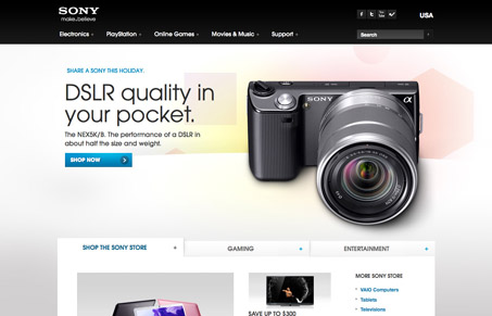
Slick. There’s a high-def feel to this site that makes it feel so sexy. In the world of selling consumer electronics and such, that’s a pretty important presence to convey. Beyond the polished UI, the layout is easily scannable and content nicely organized. When you’re relying on a site to be able to do your homework and purchase also, the value is in things being done well even if its less fancy. That being said though, it’s an adaptive layout which is a sensible bonus. Overall, there’s a good balance and marriage of marketing and e-commerce.
Looking Fast: The Art of Website Speed Perception
In the web world, technical speed and user perception matter. By improving design for a faster appearance, you boost conversions and stand out online. Speed isn’t just loading time; it’s perception.


The most unfriendly drop-down nav I have ever come across! Who decided to place actual click through items 3 to 4 drop-downs deep? When I first started using the nav I thought the site was broken!