sligerconsulting.com

sligerconsultingcom

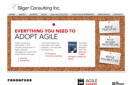
This site uses a clever little visual metaphor in the cork board, it’s a cool idea given that the company this website is for is all about helping companies learn and generating ideas. I also love the second half of the site, the bottom half, those icons and other type treatments are really good. The two halves do feel a bit separate visually but it’s not a huge distraction and i’m sure you won’t see it if you’re not looking really hard at the site like I am. Overall this is a really good website with some great content to boot.

This site is by Forty Agency.

sligerconsultingcom

This site uses a clever little visual metaphor in the cork board, it’s a cool idea given that the company this website is for is all about helping companies learn and generating ideas. I also love the second half of the site, the bottom half, those icons and other type treatments are really good. The two halves do feel a bit separate visually but it’s not a huge distraction and i’m sure you won’t see it if you’re not looking really hard at the site like I am. Overall this is a really good website with some great content to boot.

This site is by Forty Agency.

Kinsta

0 Comments

Submit a Comment

Your email address will not be published. Required fields are marked *

Time limit exceeded. Please complete the captcha once again.

News & Articles

Fitts’s Law: Why the Easy Button Wins

Fitts’s Law: Why the Easy Button Wins

Large, close targets are faster to hit than small, distant ones, that’s Fitts’s Law. A look at the 1954 rule behind buttons, prime and magic pixels, thumb zones, and dark patterns.

The Call to Action, Revisited

The Call to Action, Revisited

The Call to Action hasn’t changed in a decade, but the bar has. A fresh look at prominence, copy, mobile tap targets, and accessibility, with lessons from three major design systems.

