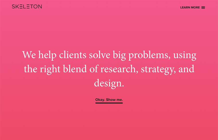
Clear layout and hip colors and type make the Skeleton website stand out. I like the focus on the case studies first – after all it’s what you want people to check out. I dig that you get a bevy of info after you make your way past those 3 project sections. Also the side nav is full of descriptive info for the links and sections.


The Call to Action, Revisited
The Call to Action hasn’t changed in a decade, but the bar has. A fresh look at prominence, copy, mobile tap targets, and accessibility, with lessons from three major design systems.


0 Comments