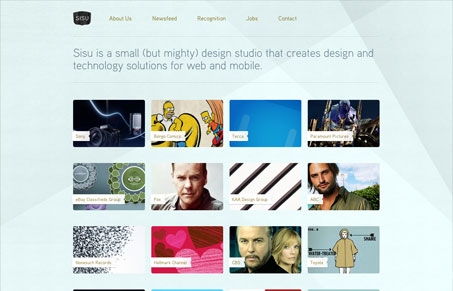
Outwardly a simple design, but make your way through it and you’ll find a host of nice details. I love the background image, it subtlety helps guide your eye around from the header into the content of the page(s). I also like how the portfolio grid stays on each page. Nice polar bear too!


0 Comments