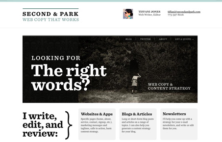
Single page layout for a web copywriter. It’s really very clever looking, I love that monster illustration, it adds a ton of personal depth and character to the website. The website is extra clean and has some great typography. I love how the page scrolls vertically to reveal more and more information, that’s a trend that I’m really liking so far.
Glassmorphism: The Transparent Design Trend That Refuses to Fade
Glassmorphism brings transparency, depth, and light back into modern UI. Learn how this “frosted glass” design trend enhances hierarchy, focus, and atmosphere, plus how to implement it in CSS responsibly.


0 Comments