Submitted by Luigi Ruggiero. Designer.
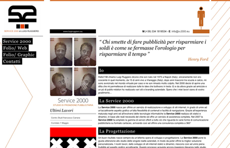
I like the orange and black together here. The background diagonals are a neat visual element that helps keep my eye rolling back towards the main content area. I like the page to page javascript animation in the portfolio section too. The frenetic pace of that animation matches the overall design really well, making that a nice touch.


0 Comments