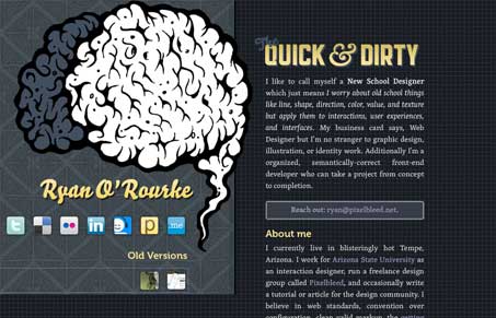
I’ve been enjoying every update Ryan does to his website. Mainly reworking the home page every few months. It’s come to be something I expect to see new and enjoy. This one is pretty good, with the large brain illustration. Mainly existing as an introduction page and leaving a way for you to get in touch or follow Ryan across the web. Great stuff.
Glassmorphism: The Transparent Design Trend That Refuses to Fade
Glassmorphism brings transparency, depth, and light back into modern UI. Learn how this “frosted glass” design trend enhances hierarchy, focus, and atmosphere, plus how to implement it in CSS responsibly.


Very to the point. Exactly what someone needs to see when looking to hire someone. Great job.
@Gavan Thanks for the kind words.
I’m a bit restless when it comes to my personal sites, but so far this one hasn’t rattled me to new action and allowed me to focus on a few other projects.
@Gene seems the auto screen shot is coming it a big cock-eye’d tho eh? Probably result of my fixed position left side.