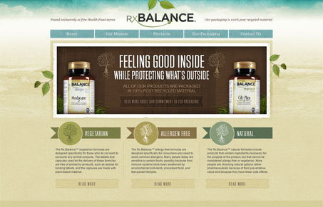
I really dig the RxBalance website. I like the background image/colors used, the watercolor(ish) style is nice. The overall layout is well balanced with copy and imagery. This is probably a super tiny detail but I love how the social media icons look like they are just hovering over the design, it makes them stand out so clearly even though they are down in the footer. Nice work on this site!
Glassmorphism: The Transparent Design Trend That Refuses to Fade
Glassmorphism brings transparency, depth, and light back into modern UI. Learn how this “frosted glass” design trend enhances hierarchy, focus, and atmosphere, plus how to implement it in CSS responsibly.


0 Comments