Submitted by Ryan O’Rourke @rourkery, Designer & Developer.
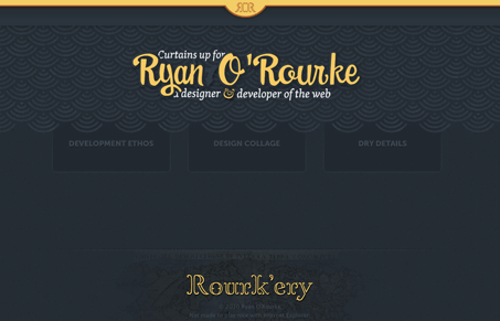
Online home of Scottsdale Arizona based web designer Ryan O’Rourke.
—
Latest personal project pulling together all my sites (which were getting to varied) into a single, simple home. Does some fun still with fluid images on the portfolio page too. Try resizing your window.
Another really nice looking version of Ryan O’Rourke’s portfolio website, we’ve featured site’s of his in the past and in a podcast here on UMS.
I like how the home page pulls together the sub-sections, that while share a lot of the same visual setup are really quite different in content and scope. The portfolio section is made with the Masonry JS as a foundation but he’s made it his own here.
I particularly like the responsive design that’s been done to these pages, resize your browser or check it out on your iPhone and you’ll see what i’m talking about. That’s another very nice touch to an already nice looking portfolio website.

Also, you can’t write off someone with “ultimate badass” as a keyword… 🙂


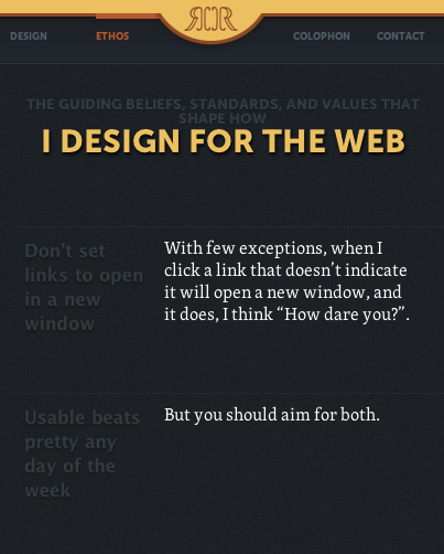
I really enjoyed Ryan O’Rourke’s site. The use of color, type and layout were harmonious and worked well together – yet, above all, the copy was fantastic. It was brief, concise, informative and entertaining.
I’m now convinced that every designer / developer should have an “Ethos” section thanks to Ryan.
Goes to show how copy can transform the site from good, to great.