
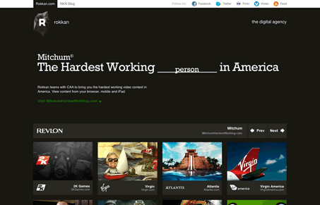
I really dig the strong 4 column grid in this layout, it’s really serving the design well. Giving it all a nice rhythm and feel. I also really like the heavy type design in the top most part of the website, i was a little disappointed to find it was just a big image, visually it’s nice but execution wise it would be awesome to have it be live text.




0 Comments