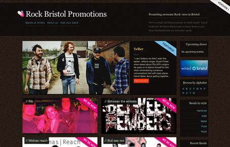
I like the colors, the dark background and the pinkish color for the highlight spots. I love the visual hierarchy on the home page, as you look down the page the images are smaller and smaller. The interactions on the 2nd level section is nice too. Cool site.
Glassmorphism: The Transparent Design Trend That Refuses to Fade
Glassmorphism brings transparency, depth, and light back into modern UI. Learn how this “frosted glass” design trend enhances hierarchy, focus, and atmosphere, plus how to implement it in CSS responsibly.


One of the coolest wordpress themes I’ve seen. Great work.