
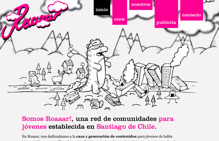
Aside from the illustration being great, I love the layout. The offset images as you scroll down the page and how they break out of the normal expected alignment of images on a page is refreshing. I love the parallax effect at the top of the page too, very nice touch.




love the color palette, style, font, layout… everything