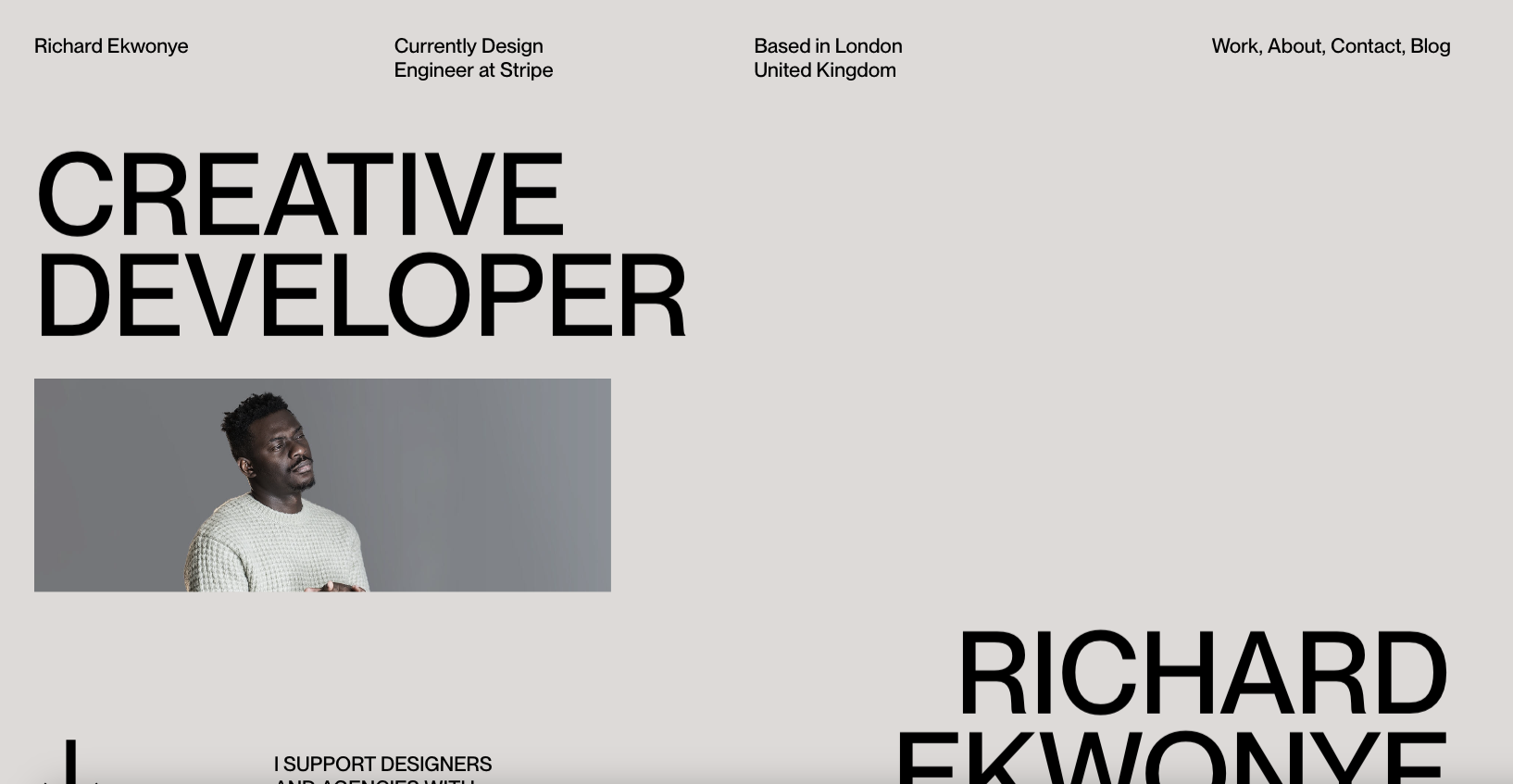
I love the broken grid layout and the bold typography. I really like the small details in the fixed nav and logo too – nice little surprise. Also has a banger blog too https://blog.richardekwonye.com/bezier-curves
Glassmorphism: The Transparent Design Trend That Refuses to Fade
Glassmorphism brings transparency, depth, and light back into modern UI. Learn how this “frosted glass” design trend enhances hierarchy, focus, and atmosphere, plus how to implement it in CSS responsibly.


0 Comments