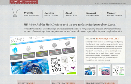
Really nice layout, I love the background image with the grid lines and the textures used in this design. I love the lines and how they support the layout and guide you around the page. The images somehow take on that same tactile feeling as well. There are some really nice illustrations/icons across the site and also some weird ones… but I really like this design.s.

Love the ascii art too!


why would you list this site? it is a cheap knockoff of sushi & robots…
http://sushiandrobots.com/
you usually have excellent taste, but this is a shocker…
Matt, damn man, totally didn’t catch that. I must have not checked Jina’s site between the last design and this one… Think we should take this site out of the gallery then?
not my call obviously, but i mean, Jina definitely worked hard to make something unique, and this is clearly a little too close.
There are some similarities between the two sites, but I don’t know if ‘knock off’ is necessarily the right word. Other than the navigation, which does, admittedly, look like a copy, there are enough differences in the rest of the design to say that it stands on its own.