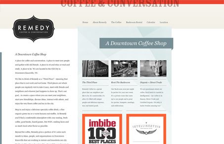
Remedy Coffee is a coffee shop in downtown Knoxville, TN that offers ‘coffee and conversation’. As someone who likes coffee and talking, this is an attractive proposition. And their site has a pleasing, if a bit austere, vibe. It’s a bit of an unorthodox layout, accentuated by the fact that there aren’t really any lines or boxes that seem to line up perfectly. This is a good way to create a dynamic that makes you want to scroll and click around. My only real problem with this site is that it doesn’t really come off as that inviting. The light blue background lends a cold vibe and the small type makes it hard to scan. While the writing is very good and conveys what I think they want Remedy Coffee to be like, there’s too much of it. I think pared down copy, warmer colors and color photos (instead of black and white) would really help the site match the vibe that I’m sure this place has when you walk into it in real life.


0 Comments