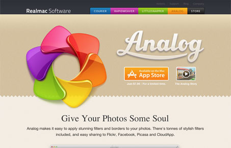
It’s unusual for us to review just a single page of a website but in this case, which was a submission from someone other than Real Mac Software (a fan I guess), we just had to take a look at it.
I quite like this product page/section. It’s super over-the-top detailed and full of crispness that you always expect from Real Mac products. It’s for a pretty straight forward app but it takes it just about as far as you can with the design. Love it!


I love the simplicity. There’s nothing over the top, nothing distracting besides the logo itself; which is gorgeous btw. Really made me want to buy the product to check it out… until I realized I could grab a six-pack for the same amount. All costs aside, it’s a nice, direct, single-page site.
I love the simple style layout and the colors are beautiful; the two shades and then highlighted with graphics really compliments the website. Though their use of jQuery really makes everything pop out which is what caught my eye Well done guys!