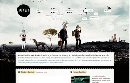
Love this freaky illustration, love it. The little bubble like 3D elements that are navigation buttons are brilliant looking as well. Somehow this site has a handmade feel at the same time having a very digital vibe, not entirely sure what that means but I do love this design. One knock I have though is that it’s the same experience on each page of the site, and since that illustration/header area is so large, you really lose a lot of the content because it doesn’t really seem to change page to page. A different subpage would go a long way to making this one of those “great” websites. Right now though it’s a really good website in my book and that pretty good work!
Glassmorphism: The Transparent Design Trend That Refuses to Fade
Glassmorphism brings transparency, depth, and light back into modern UI. Learn how this “frosted glass” design trend enhances hierarchy, focus, and atmosphere, plus how to implement it in CSS responsibly.


0 Comments