
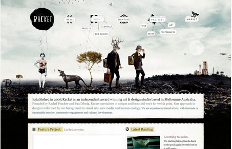
Love this freaky illustration, love it. The little bubble like 3D elements that are navigation buttons are brilliant looking as well. Somehow this site has a handmade feel at the same time having a very digital vibe, not entirely sure what that means but I do love this design. One knock I have though is that it’s the same experience on each page of the site, and since that illustration/header area is so large, you really lose a lot of the content because it doesn’t really seem to change page to page. A different subpage would go a long way to making this one of those “great” websites. Right now though it’s a really good website in my book and that pretty good work!




0 Comments