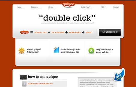
The red background makes this site burn into your brain. It also has a unique shape to the layout. I like the interactions over the three marquee areas in the middle of the page too, the way they slide up to reveal the content is nifty.
Glassmorphism: The Transparent Design Trend That Refuses to Fade
Glassmorphism brings transparency, depth, and light back into modern UI. Learn how this “frosted glass” design trend enhances hierarchy, focus, and atmosphere, plus how to implement it in CSS responsibly.


0 Comments